
Re-imagined to enhance navigation & usability.
A modern approach to intuitive, efficient, and user-friendly access.

My Role
User Researcher
UX Designer
UI Designer
Tooling
Figjam
Figma
Adobe CS
Deliverables
User Research
Prototyping
High Fidelity Designs
The U.S. Department of Education website is a resource for students, parents, and educators, providing important information on education policies, financial aid, and grants.
However, its outdated design and complex navigation hinder usability, making it difficult for users to find essential resources efficiently. Misaligned with modern UX/UI best practices, it creates cognitive overload and frustration. A research-driven redesign is needed to improve navigation, clarity, and user experience.


Key solutions, informed by user interviews, focus on intuitive navigation, responsive design, and a clear visual hierarchy to enhance accessibility and ease of use.
The redesign streamlines content organization, improves mobile responsiveness, and establishes cohesive branding, creating a modern, user-centered experience.


Journey
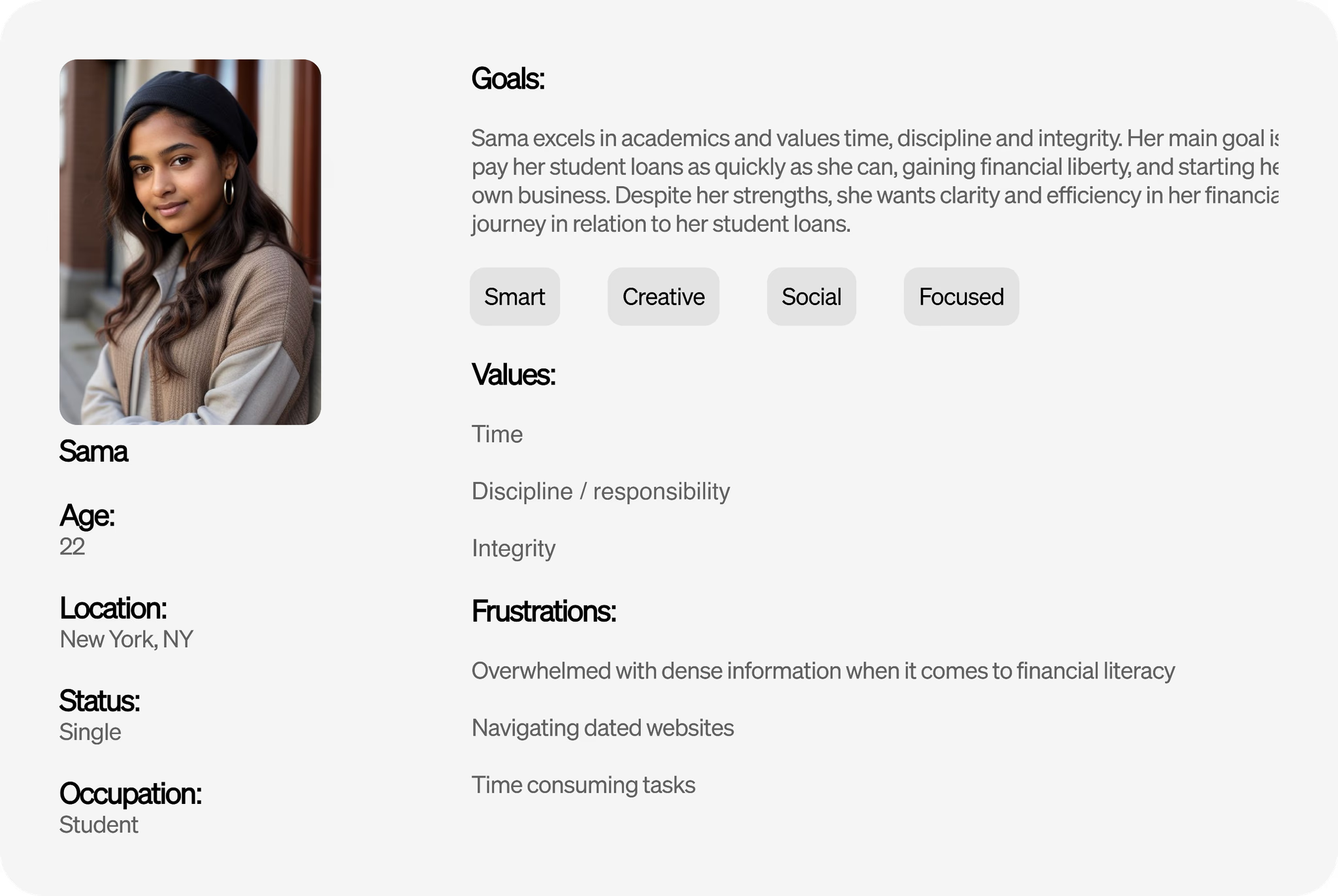
To gain deeper insights, I conducted user interviews, followed by creating an affinity diagram, empathy map, and user persona based on the findings.
Tasks Completed:
Found information on student loans.
Explored grants and scholarships.
Accessed data and research publications.
Contacted the department.
Navigation Challenges:
Confusion when redirected to an external website for grants leading to relaunching the website.
Struggled to locate the "Contact Us" option, eventually finding it in the footer.
Redlining Site
After investigating the user's path in the current Education website, a UI Analysis took place, redlining observations and areas of improvement.
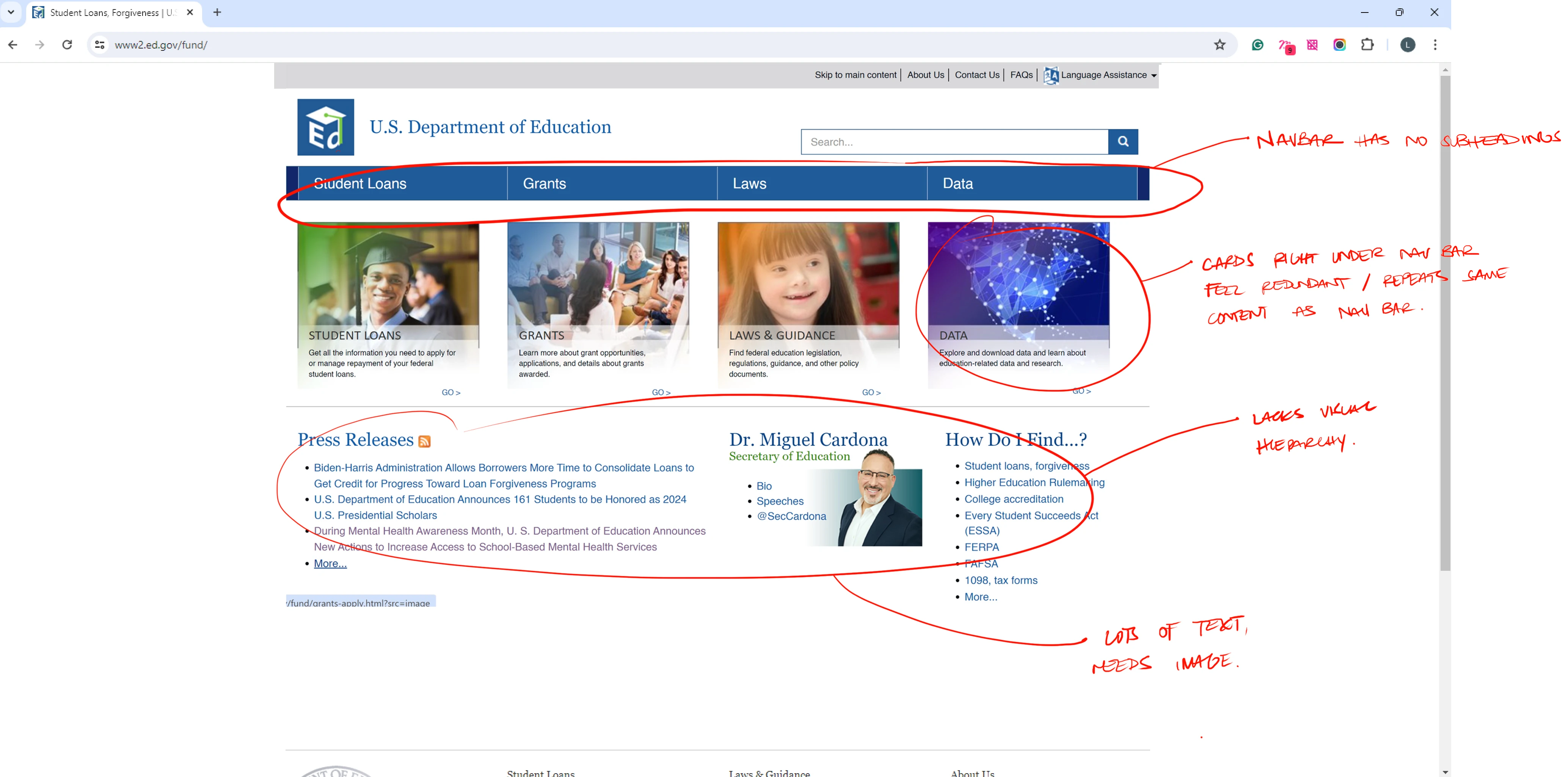
Navigation and clarity issues
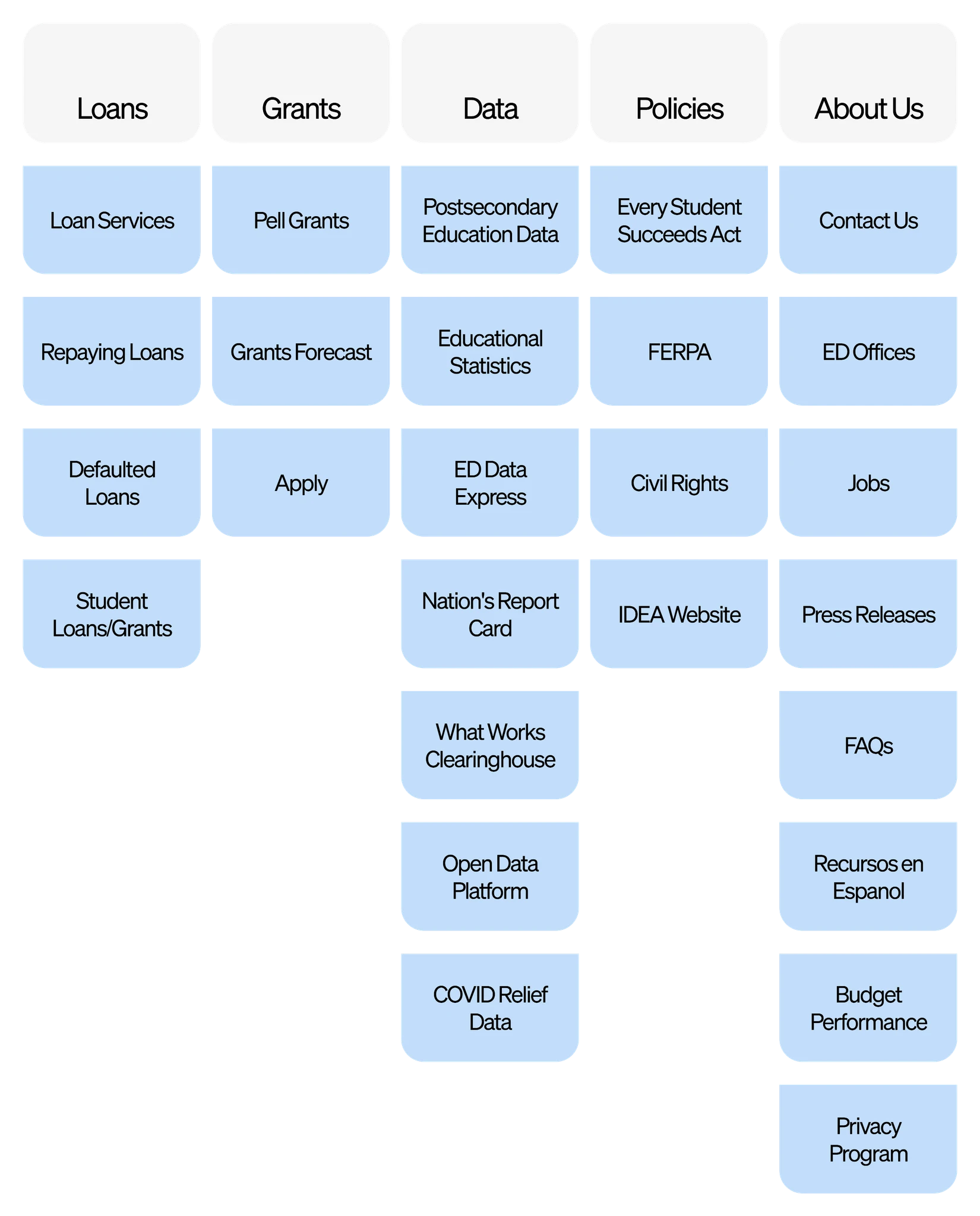
Navbar lacks subheadings, making navigation less user-friendly.
Content redundancy between navbar and cards.
Lacks visual hierarchy, making it hard to distinguish between different sections and prioritize information.
Info Overload
There is an overload of information and hyperlinks, which could overwhelm or confuse users.
Lacks effective grouping, making it harder for users to locate information.

Insights to Interface
Desktop
1512 px
Mobile
430 px
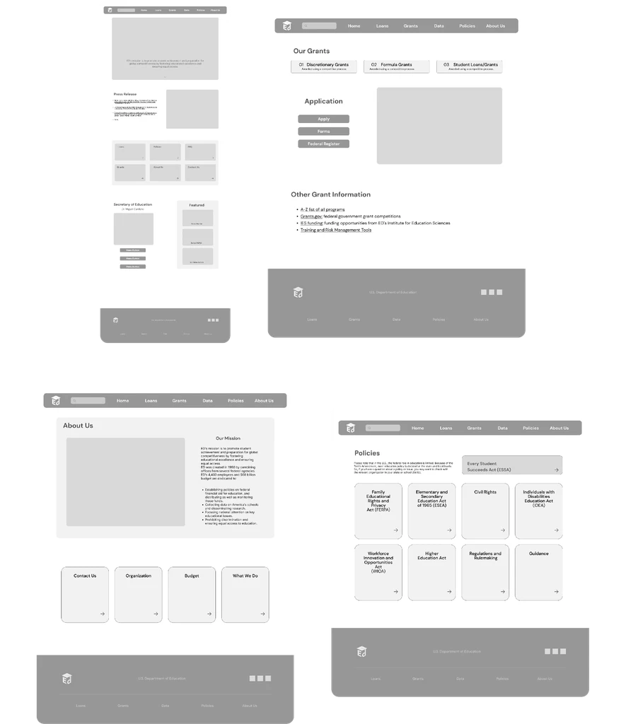
Mid Fidelity Frames

Style Guide
Brand Logo

Button States & Styles


Color Palette
Typography
DM Sans
A B C D E F G H I J K L M N O P Q R S T U V W X Y Z a b c d e f g h i j k l m n o p q r s t u v w x y z
Aa
Regular
Medium
Semibold
Bold
Inter
A B C D E F G H I J K L M N O P Q R S T U V W X Y Z a b c d e f g h i j k l m n o p q r s t u v w x y z
Aa
Re-Imagined
Our Grants

Quieting down the noise, the new redesign offers a clear path for users to find what they need in order to apply for a grant/loan. Effective grouping is the main focus, both visually and information wise.

About Us

The redesigned About Us page focuses on facilitating the user to find information, whether it is learning about the Department of Education, or finding resources, from contact information to budgets.
Re-Imagined: Mobile


Post-Design
Redesigning a whole website is no small task, but that’s what makes it exciting.
Redesigning the U.S. Department of Education website has been a pivotal project in my growth as a product designer. It reinforced the importance of prioritizing the user experience and how essential interviews and testing are in driving meaningful results. Without research and data, even the most polished design is just decoration—visually appealing but functionally hollow.
Future Steps
More User Interviews and Tests: Another round of tests and interviews to ensure positive impact and effectiveness of my redesign.
Integrating log in and application portals, prioritizing a smooth and effective experience for users.
Responsive tablet design: With the growing pace of users preferring tablets over laptops, it is definitely a must in next steps of the redesign.